
Frontend & UI
Framed Grid Layout
Build precise editorial layouts with thin frames and corner brackets.
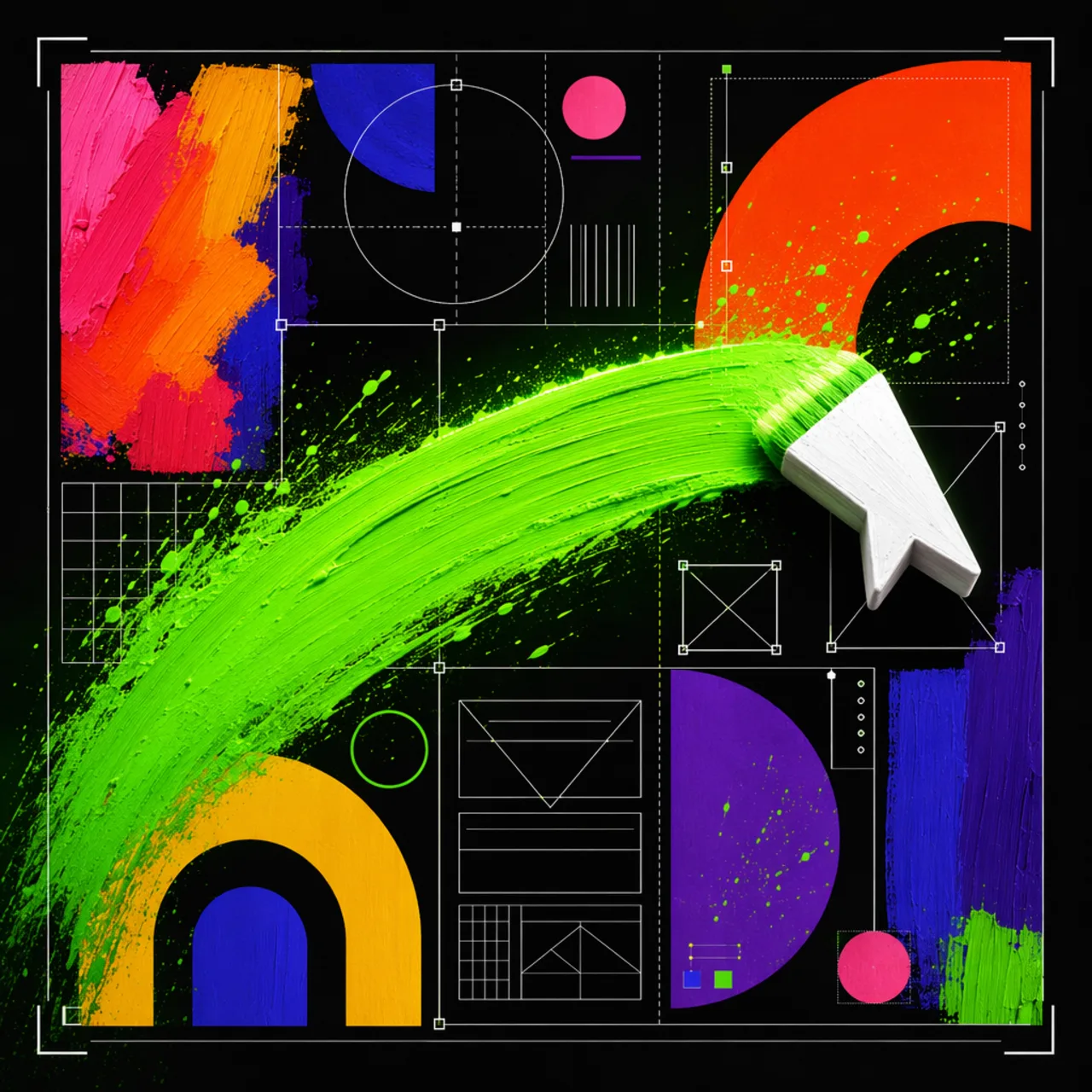
What it is
A twelve-column grid pattern where every section snaps to shared columns inside 1px framed boxes. L-shaped corner brackets are drawn as background layers over a low-opacity diagonal texture.
Create minimal framed grid layouts with thin visible boundary lines, L-shaped corner brackets, subtle diagonal line texture, and strict section alignment. Use when asked for clean, neutral, precise, structured, editorial
Why it matters for design
- Every section shares one border color, one bracket size, one spacing scale.
- Corner brackets need no extra markup, so structure stays in CSS.
- The layout still reads clearly if the texture layer is removed.
What it covers
- Use when
- Layout rules
- Base tokens
- Parent grid
- L-shaped corner brackets
- Section spans
How to install
Framed Grid Layout
-
Clone the repo.
git clone https://github.com/MengTo/Skills -
Point Codex at the skill file.
agent-skills/web-design/framed-grid-layout/SKILL.md -
Then describe the UI you want. Codex follows the skill.
How to run it with Codex
-
Ask for a technical or editorial page and get the parent grid first.
-
Assign explicit span classes instead of ad hoc section widths.
-
Verify frame edges align vertically and horizontally at both breakpoints.
Every plugin here is free, open source, and links to its real upstream source.
More on the codex-design list ↗More Codex design plugins
 Frontend & UI What it does gpt-taste Builds award-style landing pages with GSAP scroll motion and gapless bento grids.
  Design Systems What it does Stitch Design Taste Writes a DESIGN.md that steers Google Stitch toward non-generic screens.
  Frontend & UI What it does image-to-code Generates design images first, analyzes them, then builds matching frontend code.
  Frontend & UI What it does imagegen-frontend-mobile Generates premium mobile app screen flows as images, not code.
 Next step
Design with OpenDesign, without the setup
Install this plugin yourself, or run a whole curated design layer around Codex with OpenDesign. Bring your own key, own your output.